Handle user input
TextField
- Material Design implementation. 스타일이 기본적으로 적용되어있음
- value — 기본으로 입력필드에 노출되는 값
- onValueChange — 인풋 필드 값에 변화가 생겼을 때 수행 할 이벤트
- label — value가 빈값이면 처음 인풋 영역에 크게 노출되었다가 인풋 값을 입력하면 상단에 작게 노출되는 label 값
Row {
    var text by remember { mutableStateOf("Hello") }
    Text("TextField: ")
    TextField(
        value = text,
        onValueChange = { text = it },
        label = { Text("Label") },
    )
}

- 포커스 상태에서 값을 입력하면 remember value, onValueChange에 의해 입력한 값이 그대로 노출된다.
BasicTextField
- 스타일이 적용되어있지 않은 기본 텍스트 필드
- hint, placeholder 등을 제공하지 않음
Row {
    var text by remember { mutableStateOf("") }
    Text("BasicTextField: ")
    BasicTextField(value = text, onValueChange = { text = it })
}
OutlinedTextField
- outline 스타일이 적용되어있는 텍스트 인풋 필드
Row {
    var text by remember { mutableStateOf("") }
    Text("OutlinedTextField: ")
    OutlinedTextField(
        value = text,
        onValueChange = { text = it },
        label = { Text("Label") },
    )
}

TextField 스타일 | singleLine, maxLines, textStyle
TextField에는 커스터마이징 할 수 있는 다양한 파라미터 옵션들이 존재합니다. 디자인이 필요하다면 BasicTextField 대신에 TextField 혹은 OutlineTextField 를 사용하는 것을 추천합니다.
- singleLine — true / false(default)
- maxLines — Int value
- textStyle — TextStyle(color, fontWeight, …)
Row {
    var text by remember { mutableStateOf("") }
    Text("TextFieldStyle: ")
    TextField(
        value = text,
        onValueChange = { text = it },
        label = { Text("Enter text") },
        singleLine = true,
        textStyle = TextStyle(color = Color.Blue, fontWeight = FontWeight.Bold),
        modifier = Modifier.padding(20.dp)
    )
}

Row {
    var text by remember { mutableStateOf("") }
    Text("TextFieldStyle: ")
    TextField(
        value = text,
        onValueChange = { text = it },
        label = { Text("Enter text") },
        maxLines = 5,
        textStyle = TextStyle(color = Color.Blue, fontWeight = FontWeight.Bold),
        modifier = Modifier.padding(20.dp)
    )
}

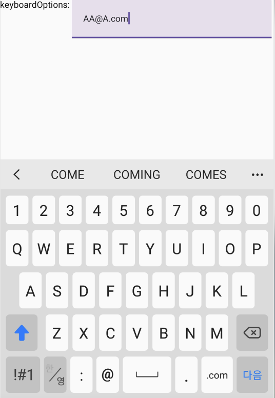
좌측 사진을 보면, singleLine 을 true로 설정했을 때 키패드 우측 하단 버튼이 “완료”로 나타나는 것을 볼 수 있습니다. (우측 사진은 줄바꿈 버튼입니다.) 실제 입력도 한줄로만 길게 이어지는 식으로 입력됩니다.
반면에, maxLines 는 생각과 다르게 동작했는데요. 🤔 의미만 보고 최대 n줄까지 입력가능한 것인 줄 알았는데 막상 수행해보니 줄바꿈은 n줄을 초과해서 계속 가능하고 노출되는 텍스트 필드 영역이 n줄인 것으로 보였습니다.
우측 사진은 “ff”를 5줄을 입력한 뒤에 엔터를 눌러 다음 줄바꿈을 한 것입니다. 실제로는 6번째줄을 입력 중이었지만 노출되는 영역은 5줄까지인 것을 볼 수 있었습니다. (maxLines를 설정하지 않으면 줄바꿈을 했을 때 인풋 영역이 계속 늘어나는 것 같습니다.)
TextField에 Brush 적용하기 | TextStyle(brush = ___)
- Text에 적용했던 Brush를 TextField에도 적용할 수 있음
- TextField 내부의 textStyle에 brush 적용
- TextStyle(brush = Brush.___)
- 주의: experimental API
- Note: 입력중인 필드에 brush를 적용하려면 remembere를 사용!
Row {
    var text by remember { mutableStateOf("") }

    val gradientColors = listOf(Color.Cyan, Color.Magenta, Color.Yellow)
    val brush = remember { Brush.linearGradient(colors = gradientColors) }

    Text("TextField Brush: ")
    TextField(
        value = text,
        onValueChange = { text = it },
        textStyle = TextStyle(brush = brush)
    )
}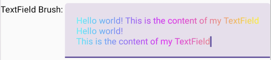
인풋 필드에 Cyan, Megenta, Yello 순으로 선형그라디언트 brush를 적용했을 때, 인풋 필드가 가지고있는 가로 길이가 그라이디언트의 길이가 되는걸로 보였습니다. 위 사진처럼 줄바꿈을 하면 항상 Cyan 색상부터 시작이며, 인풋필드의 끝으로 가야 Yello 색상이 나타나는 것을 볼 수 있습니다.
KeyboardOptions
입력 텍스트필드에 KeyboardOption를 지정하여 키보드에 대한 여러 옵션을 설정할 수 있습니다. 단, 키보드에 따라 적용되지 않을 수 있습니다.
- capitalization — 키보드를 대문자로 노출시키는 조건. (None, Characters-모든문자, Words-단어첫글자, Sentences-문장첫글자)
- keyboardType — 입력형태에 따른 키보드 타입. (Text, Number, Email…)
- autoCorrect — autoCorrect 활성화 여부. (Email과 같은 텍스트 기반 KeyboardType에만 적용됨)
- imeAction —키보드에 특정 아이콘 표시. (Go, Search, Done…)
Row {
    var text by remember { mutableStateOf("") }
    Text("keyboardOptions: ")
    TextField(
        value = text,
        onValueChange = { text = it },
        singleLine = true,
        keyboardOptions = KeyboardOptions(
            capitalization = KeyboardCapitalization.Characters,
            keyboardType = KeyboardType.Email,
            autoCorrect = true,
            imeAction = ImeAction.Next
        )
    )
}
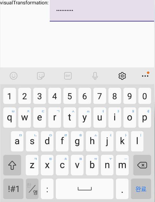
VisualTransformation | PasswordVisualTransformation()
입력 값에 대한 노출형태를 변경할 수 있습니다. 패스워드를 입력할 때, 카드번호를 마스킹할 때 주로 사용됩니다.
Row {
    var text by remember { mutableStateOf("") }
    Text("visualTransformation: ")
    TextField(
        value = text,
        onValueChange = { text = it },
        singleLine = true,
        visualTransformation = PasswordVisualTransformation(),
        keyboardOptions = KeyboardOptions(keyboardType = KeyboardType.Password),
    )
}
선행문자로 “0”이 입력되지 않도록 구현하기 | onValueChange
onValueChange를 활용하는 예제로, 사용자가 어떤 케이스에 의해 어떤 값을 입력할지 모르는 상황에서 입력된 값을 변경하는 로직입니다. 새로운 텍스트가 입력되었을 때, 선행문자로 위치한 “0”을 모두 제거합니다(trimStart).
Row {
    var text by remember { mutableStateOf("") }
    Text("keyboardOptions: ")
    TextField(
        value = text,
        onValueChange = { newText ->
            text = newText.trimStart { it == '0' }
        }
    )
}
텍스트 필드의 효율적인 state 관리
Enable user interactions
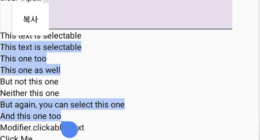
텍스트 선택 가능하도록 하기 | SelectionContainer
기본적으로 컴포즈의 Text는 선택 및 복사를 할 수 없게 되어있습니다. Text를 선택가능하게 만들고 싶다면 SelectionContainer로 선택할 영역을 감싸주어야합니다.
Row {
    SelectionContainer {
      Text("This text is selectable")
    }
}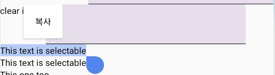
텍스트 선택 막기 | DisableSelection
선택할 수 있도록 선언해놓은 영역 내에서 일부만 선택불가능하도록 하고싶다면 DisableSelection으로 선택할 영역을 감싸주면 됩니다.
Row {
    SelectionContainer {
        Column {
            Text("This text is selectable")
            Text("This one too")
            Text("This one as well")
            DisableSelection {
                Text("But not this one")
                Text("Neither this one")
            }
            Text("But again, you can select this one")
            Text("And this one too")
        }
    }
}
텍스트 클릭하기 | Modifier.clickable
Modifier에 clickable을 선언하여 클릭했을 때 원하는 이벤트를 수행할 수 있습니다.
Row {
    Text(
        text = "Modifier.clickable Text",
        modifier = Modifier.clickable(onClick = {
            Log.d("Modifier.clickable", "Text clicked")
        })
    )
}

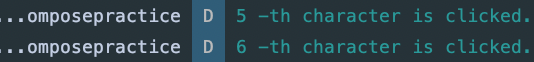
텍스트 클릭 포지션 알아내기 | ClickableText
ClickableText를 사용하면 onClick에 전달되는 offset을 통해 Text의 몇번째 position을 선택했는지 알 수 있습니다.
Row {
    ClickableText(
        text = AnnotatedString("Click Me"),
        onClick = { offset ->
            Log.d("ClickableText", "$offset -th character is clicked.")
        }
    )
}
클릭영역에 대체텍스트 설정하기 | pushStringAnnotation, pop
- pushStringAnnotation — pop 사이의 컨텐츠가 TAG로 구분됨
- ClickableText에서 클릭한 텍스트가 TAG로 지정된 컨텐츠라면 클릭이벤트를 수행함
Row {
    val annotatedText = buildAnnotatedString {
        append("Click ")

        // "URL"태그는 pop()이 호출되기 전까지 content를 나타낸다.
        pushStringAnnotation(
            tag = "URL", annotation = "https://developer.android.com"
        )

        withStyle(style = SpanStyle(color = Color.Blue, fontWeight = FontWeight.Bold)) {
            append("here")
        }

        pop()
    }

    ClickableText(text = annotatedText, onClick = { offset ->
        // 클릭된 위치에 "URL"태그가 있는지 확인하고, 있으면 클릭이벤트 수행
        annotatedText.getStringAnnotations(
            tag = "URL", start = offset, end = offset
        ).firstOrNull()?.let { annotation ->
            // If yes, we log its value
            Log.d("Clicked URL", annotation.item)
        }
    })
}

Text에서 사용자와 인터랙션하는 예시는 여기까지 입니다.🙃
